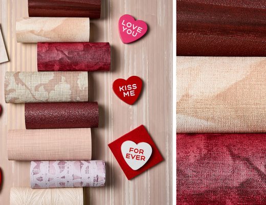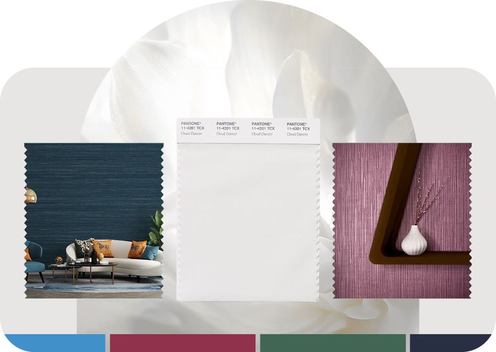
It’s official: the industry has embraced the “clean slate.” But as any designer knows, a blank canvas is only as good as what you put on it. While we appreciate the timeless nature of white, we’ve always been more interested in what happens when you color outside the lines. Trends are often forecasted by committees, but they are set by the visionaries in the studio. At MDC, we believe your intuition carries more weight than any “Color of the Year” announcement. We’re not here to tell you what’s in; we’re here to provide the textures, tones and materials that prove you already know.
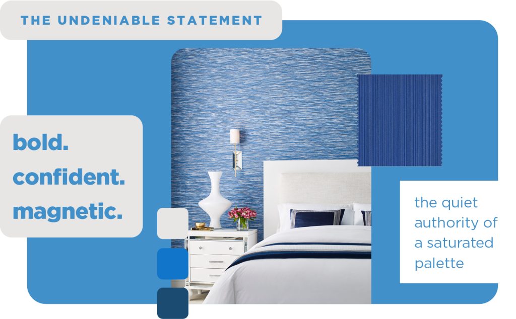
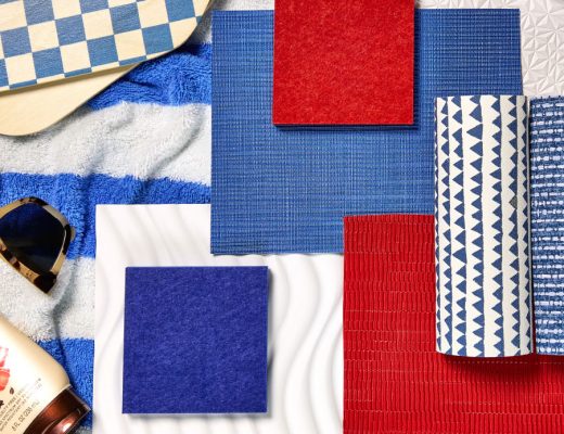
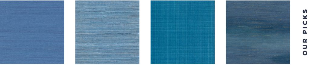
Out of the Blue
While the rest of the world is busy painting it safe, we’re looking toward the deep end. Saturated, high-energy blues offer a visceral counterpoint to the “Color of the Year” consensus. They pull the eye, anchor the room and suggest a designer who isn’t afraid to make waves. After all, a trend isn’t something you follow, it’s something you dive into!
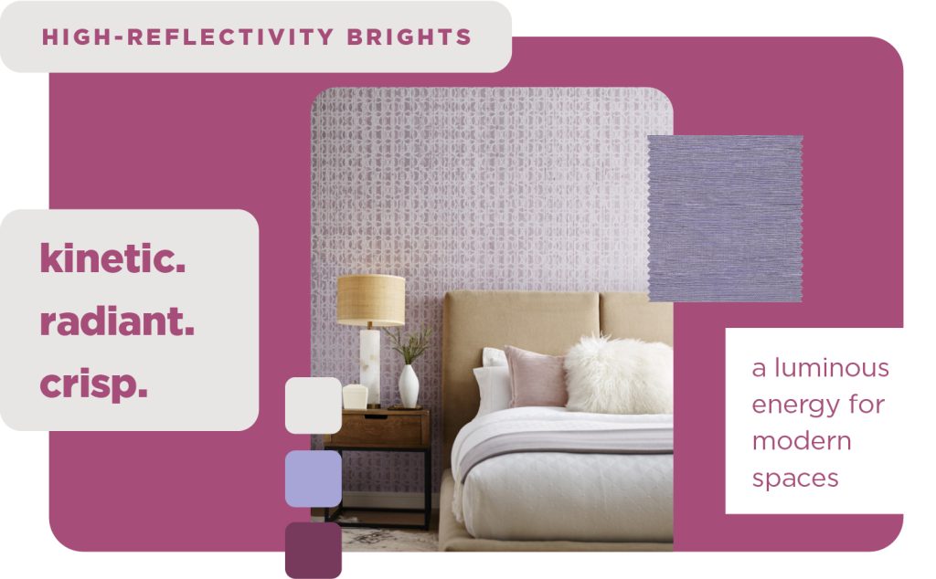
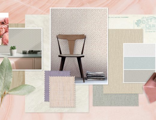
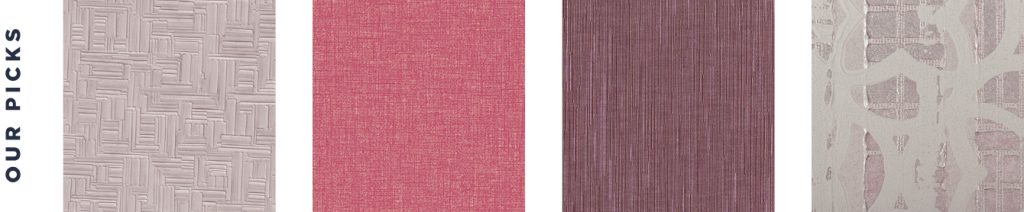
Chromatic Clarity
To move beyond the expected, one must embrace a certain chromatic intensity. Our sharp, icy lavenders offer a crystalline clarity that feels both futuristic and structural. When paired with dazzling, high-saturation pinks, the result is an interior that feels less like a room and more like a gallery. These are high-definition hues designed for those who understand that “bright” is a synonym for “bold.”
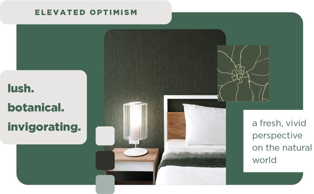
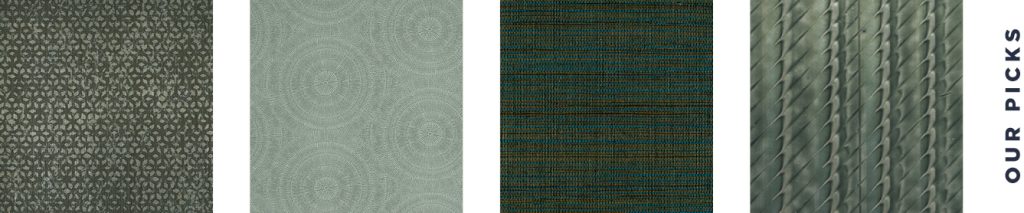
Green-Lighting Your Intuition
If white is the canvas, these uplifting greens are the breath of life. Moving beyond the safety of neutrals means embracing the restorative power of a truly vibrant green. From lush, botanical teals to high-energy ferns, these shades offer a sense of growth and renewal that a static white cannot provide. It’s about more than just color; it’s about injecting a room with an organic energy that feels both grounding and profoundly modern.
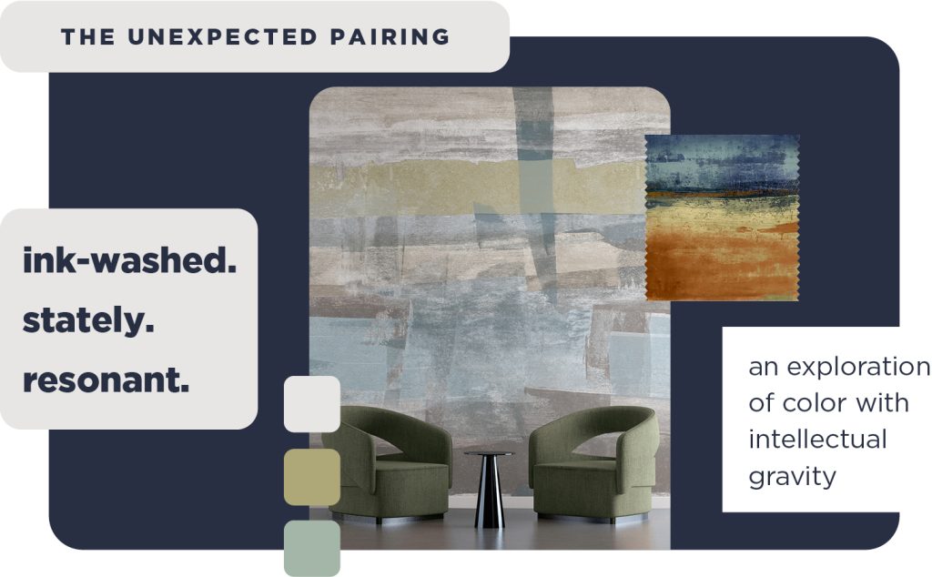
Mastering the Mood
True luxury is found in the details—those moments where color and texture converge to create something multidimensional. While white is a flat surface, our deep, ink-washed blues and nuanced, cool neutrals offer a tactile narrative. These rich textures don’t just occupy space; they hold the light, adding a layer of architectural gravity and sensory depth that turns a simple wall into a masterpiece.
Your Year, Your Trend
White is a classic but your portfolio is anything but basic! Whether you’re diving into deep blues or high-energy pinks, the only trend that truly matters is the one you’re about to create.
Ready to set the tone? Email our team at info@mdcwall.com, and let’s bring your vision to life!